The flagship store of the Spanish brand Techsize Jiangsu is located in the inner part of the street park next to Nanjing Mengdu Street, where the unique and powerful outline of the building can be seen vaguely through the grove of trees by passers-by.
Techsize is a brand established by NEOLITH, a world-renowned rock slab company, after its introduction to the Chinese market. The part of its name Tech stands for Technology and the spirit of innovation while Size stands for the pursuit of constantly pushing boundaries.
Through the design of the building facade and interior space, Techsize hopes to show the brand’s ultimate pursuit of living aesthetics, highlight the brand concept of “creating the living space of your dreams”, and further show people how the brand can make the non-renewable natural element of stone sustainable, integrating man with nature and aesthetics.
01 Rock-forming stones
The process of forming sintered stone lab requires grinding and extracting the natural raw stone, which undergoes a special process such as pressing, high temperature, and eventually taking its form. Drawing design inspiration from this, the designer transforms through abstraction the original rock formation into an expression of the qualities of space.
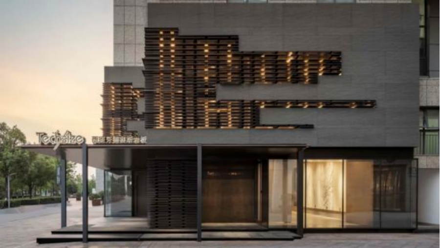
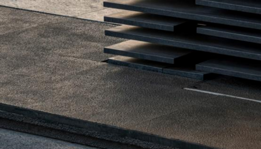
The facade is clad in slate. At the ground floor entrance, a slender corbel supports the wide eaves of the projecting roof, while the large glass exterior on the south and east greatly mitigates the heaviness of the dark gray slab. The first floor facade is clad in dark gray slabs, interspersed with horizontally stacked slabs. The slabs are set in an orderly and rhythmic manner on the first floor facade, as if to tell the story of the formation of the original rock formations. The interplay of “line and surface”, “lightness and heaviness”, “translucency and density” bring a balance to the facade hidden beneath the conflict, which looks extremely dramatic.
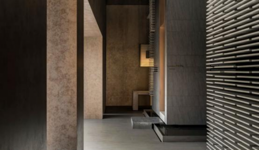
The cascading rock panels extend from the building facade into the interior as one of the main elements throughout the shop showroom. It can be a backdrop for a large electronic screen, a screen, a partition, a decoration, or the product itself, where they form long and short shadows in the light, like a melodious song.
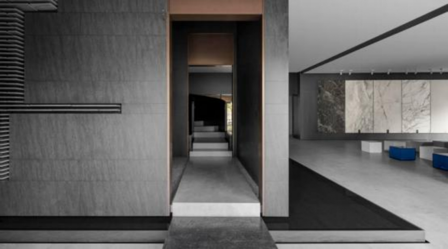
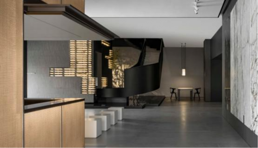
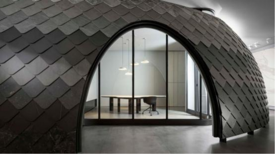
The thick black revolving staircase leads up into a seemingly roofless dome. One needs to emerge from the semi-circular hole to see the full picture of this “dome”: a rounded square rock slab 6mm thick is layered on the surface of the dome that follows a certain colour pattern, and these dark gray and light gray slabs resemble the smoothly layered feathers of a bird, hence the name “feather wall”. The wall not only serves as a space divider, but also as a product display wall that customers can get close to while experiencing the different colors and textures of the slab products.
02 The convergence of space
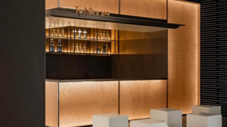
In terms of functional partitioning, the designers have adopted a multi-group spatial layout to combine display, experience, communication and work. The ground floor of the exhibition hall is divided into a display and open working area on the west side and a sharing area on the east side. Closest to the street-facing entrance is the sharing area, where a bar and a video sharing area are set up for random client events and design sharing sessions. Moving inwards along the glass wall, you are led by low steps guided by different coloured rock panels into a “square box”. This is the beginning of a revolving staircase and a “moonlight box” of raw stone sublimated into slabs: the black stones on the floor, the shadows of trees and water behind the cut-outs in the walls, and the huge slabs suspended from above, combine nature and heaven in a square box. The designers have also created an open working area on the north and west sides of the box, which can, of course, also be used for receptions.
The first floor is divided by a dome-shaped “feather wall”. The interior of the wall contains a conference room and a more secluded office, while the exterior is a product display area, showing the different uses of the slabs in domestic spaces, such as living rooms and kitchens.
03 Birth
Through exposure to the nature, with rain, wind and sunshine at play, stones came to this world in its original form. They then became the place where slabs were born. Here, the designer has created a “place of nature” , bringing natural elements such as water, plants and black stones into the showroom space. The heaviness of the slate itself is balanced with a sense of movement and breath, which creates a soft and poetic atmosphere for the showroom. At the same time, the story of nature and slate is also gradually unfold.
Contact sales@coohom.com to learn more about our solutions.
Contact marketing@coohom.com to get partnerships, and share more insights.
Social Contact:

