On 19th July, the first Coohom Whole-house Design Video Competition was successfully concluded, aiming to enhance the video marketing capabilities of the interior design industry under strong support from numerous partners. The competition attracted a wealth of outstanding designers who produced a multitude of high-quality works.
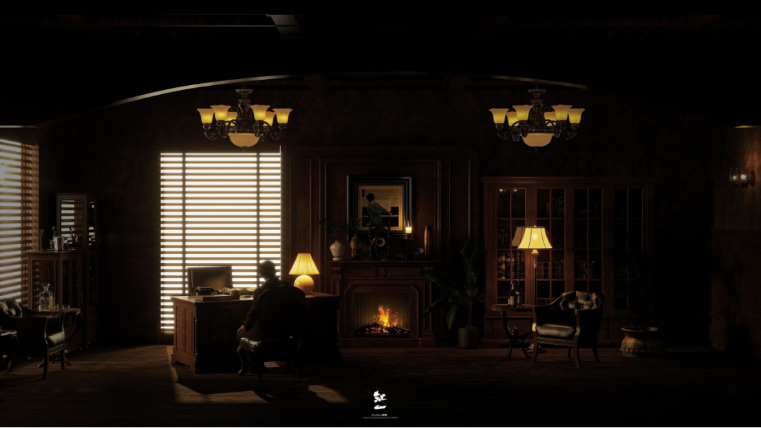
God Father
Designer: Hongyi
Story of the work:
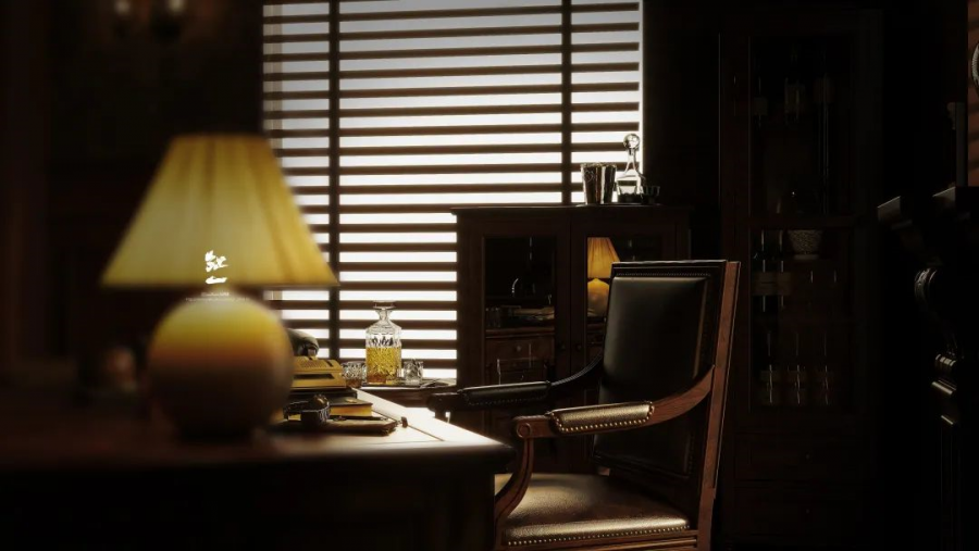
The inspiration for this work stems from the classic film The Godfather. Throughout the video, an array of meticulously crafted shots were imbued with the exquisite beauty of film and served as a gateway for the audience to effortlessly step into the protagonist’s shoes, giving them a vivid and immersive experience. As a result, a deepened sense of pride and accomplishment is nurtured within, forging an even stronger emotional connection between the viewers and the artwork.
This artwork demonstrated a high level of completion, with a masterful use of lighting that creates a rich and immersive atmosphere. The unconventional approach taken in this project showcases originality and refined craftsmanship, presenting a stunning and meticulously designed video. The material choices were executed to perfection, enhancing the overall quality of the piece.
The ingenious path planning employed in the video transported viewers into the cinema, providing them with an unparalleled visual experience akin to a movie spectacle. The harmony between the musical score and the scene and the integration of visuals and subtitles created unity in the video. Empowered by Coohom’s easy design tool and fast rendering speed, the video presented an unexpected beauty and smoothness. Overall, this artwork embodied a profound understanding and application of cinematic elements, showcasing creativity, technical finesse, and an ability to evoke emotions through an immersive audiovisual journey.
Having worked as an interior designer for five years, Hongyixiaoguo has accumulated a wealth of experience in the industry. Despite this achievement, they didn’t become complacent or stopped his pursuit of learning.
With the constant evolution of consumer demands, people’s expectations for home decoration vary greatly. This places higher requirements on interior designers. Hongyi believes that an excellent design should possess personalized characteristics while catering to individual preferences in order to gain consumer recognition to a greater extent. “Design should keep up with the times, and the design principles for each stage will change along with age, experience, and exposure to new things.”
Hongyi said that he had the idea of using film shots in a roaming video as soon as he came across this competition. However, due to his busy workload, it remained just an idea and was not put into action until three days before the submission deadline when he started the modeling process. But when rendering, the complexity of the visual design and the intricate texturing resulted in continuous failures, preventing him from completing the artwork.
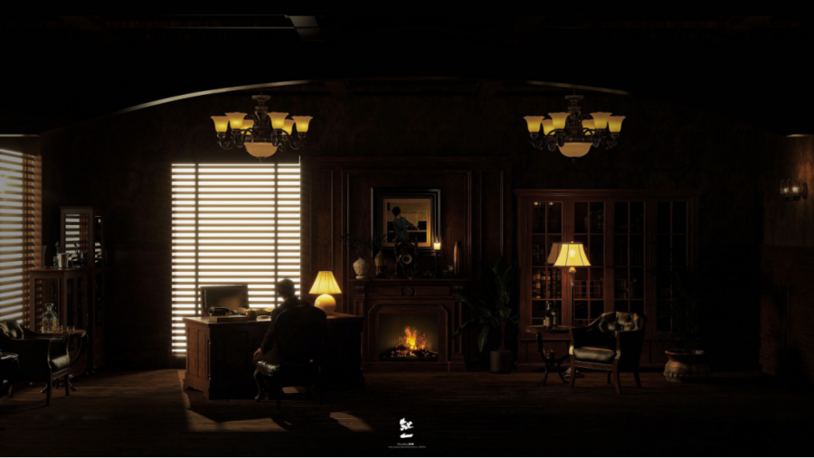
With only one day left until the submission deadline, Hongyi set aside all their ongoing work and started afresh with a new plan for modeling and rendering. “Actually II didn’t have high expectations from the start,” said Hongyi. However, on that evening, with the help of the high-definition rendering capabilities of Coohom, he was able to complete the rendering of the roaming video within hours, which allowed him to finish the work that night and manage to participate in the competition.
More Excellent Works:
Mirror
The theme of the space is modern simplicity, creating a calm and atmospheric ambiance through the combination of wooden textures, glass, and hard surfaces. The color palette primarily consists of black, white, and gray, with warm tones interspersed as accents. Additionally, the use of stone panels adds a touch of refinement to the space with the well-coordinated colors and material textures in each area, giving a sense of depth and sophistication.
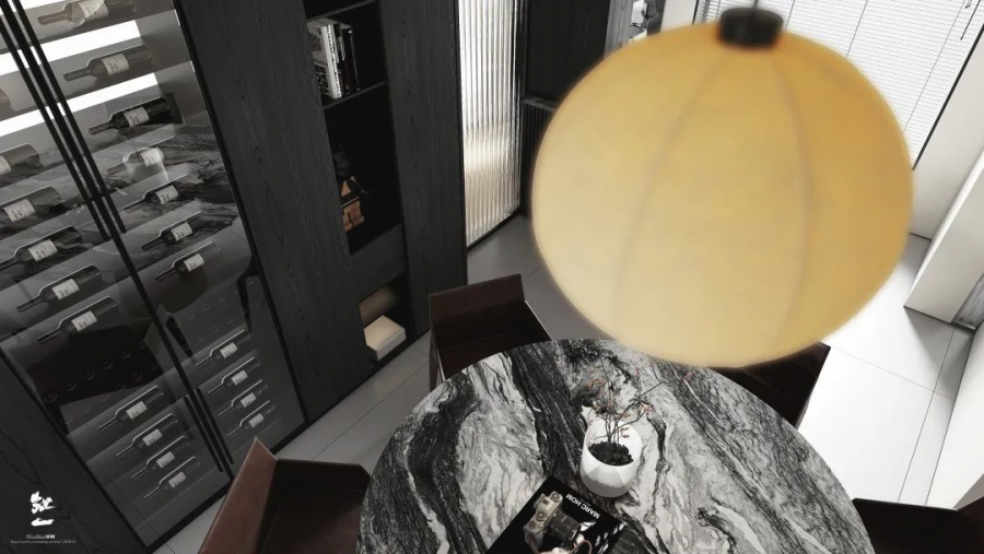
The living room space embraces a minimalist and luminous design, with walls free from cluttered decorations. By incorporating grid patterns and hollow shapes, the perfect balance of negative space is achieved. The ambiance lighting and sloped ceiling design further enhance the sense of refinement for the space.
Vintage
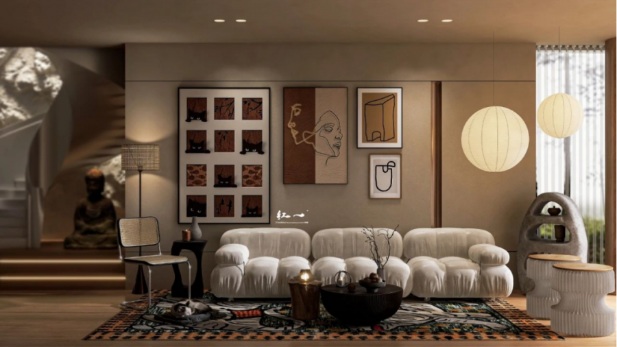
The overall space exudes a solid retro vibe, with the use of fabric upholstery adding a gentle touch. The color palette is primarily warm tones, complemented by the combination of metal and wood materials, creating a space that is both pure and warm. The smooth flow lines and spacious arrangements offer practical features.
Contact sales@coohom.com to learn more about our solutions.
Contact marketing@coohom.com to get partnerships, and share more insights.
Social Contact:
