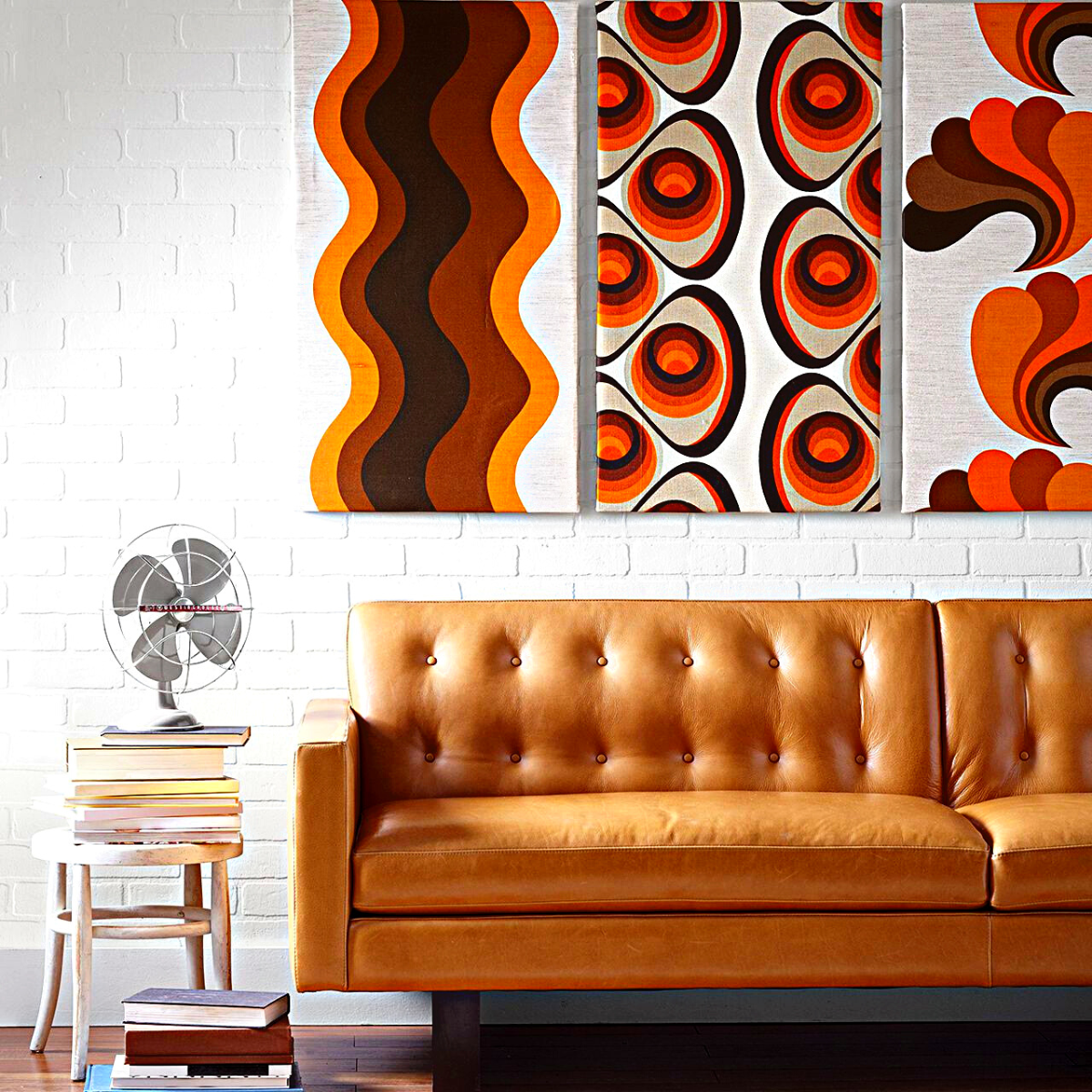
A touch of retro is more than enough to spruce up a home. Gentle suggestions of burnt orange, moss greens, and other warm neutrals brighten up-and-coming interiors.
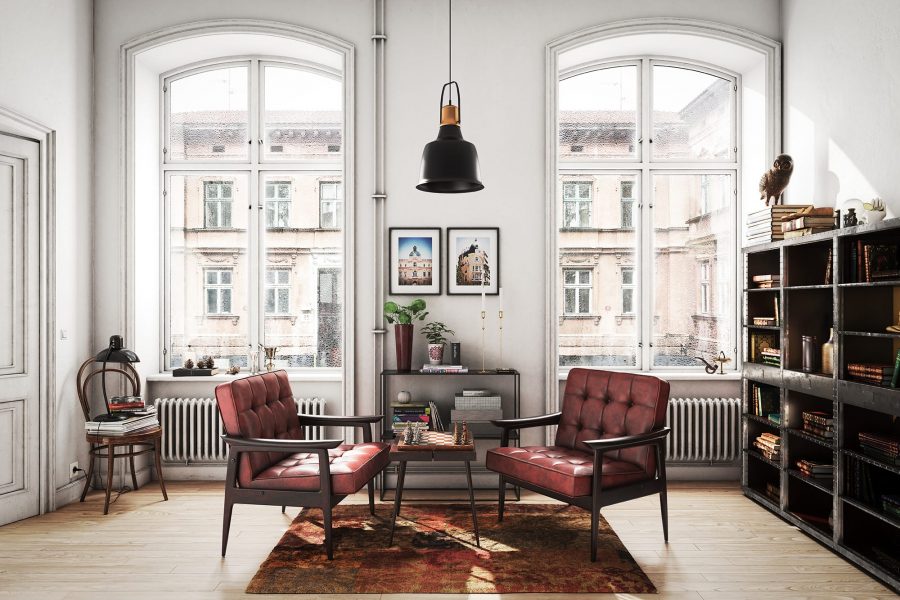
Many recent interior design trends are inspired by the 1970s. And the great 1970’s interior designer David Hicks once said, “The best rooms have something to say about the people who live in them.” While this is a wonderful sentiment, think back to grandma’s house with plastic-covered furniture, synthetic crushed velour, appalling shades of orange, and, save us all, shag carpet. Unfortunately for grandma, they were a product of their time when plastics were still new enough to be fashionable and shaggy carpet matched men’s flowing hair.
The ’70s were a time of excess, both in spirit and in the case of interior design, a muddy brown orange hue that will hopefully lay at rest with its own epoch. That said, the old adage that everything comes back around holds true. The 1970’s design trend isn’t overwhelming modern interiors just yet, but the new season is a harbinger, a sophisticated extraction of the era’s good moments. New trends are cherry picking elements such as low-slung seating, playful florals, and even wood paneling. These are all seeing a sophisticated resurgence, thanks to the help from brands such as Bode and Green River Project. The nostalgia for warm, earthy tones and materials like rattan feels comforting this time around, if even a little freeing from maximalist color.
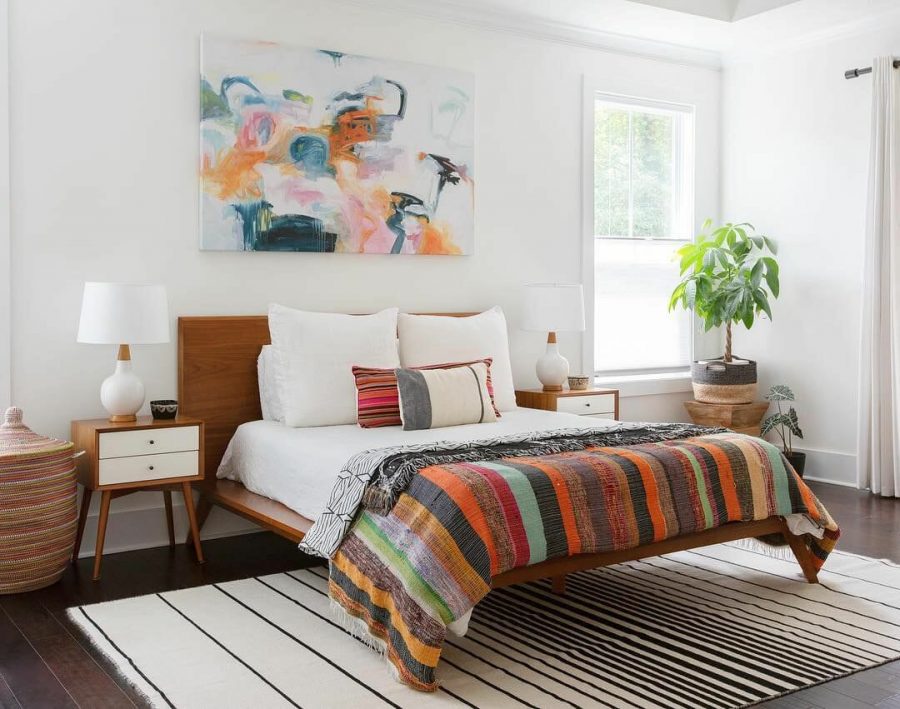
From faded chinoiserie to Palm Beach glam, this curated selection of product shows that the 1970s is a decade worth revisiting, just approached with a cleaner, more modern conviction in design.
Interior design in the ’70s certainly had its quirks. It was a decade defined by wall-to-wall shag carpeting, funky technicolour furniture, and knickknacks galore, but 1970s interior design also encompassed many timeless elements that are once again resurfacing in homes today. Current decor trends like rattan furniture and earthy colour schemes stem from the retro style and are now emerging from the past in modern ways.
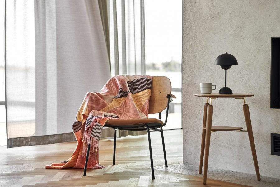
Because of the popularity of wood in homes, dark colour palettes also became more widely used as the 1970’s progressed. In the mid-to-late 1970s, Pine wood replaced teak wood, and colour palettes became even darker. The shapes of 70’s furniture was very similar to the Nordic style. Furniture with high thin legs was particularly popular for sofas and tables, creating a very slim and elegant look. However, the 70’s style is playful and adaptive when it comes to combining both curved shapes and geometric lines together within a space. Doing this creates character within a space. The 70’s style focusses on bold and warm hues but using these colours sparingly against more neutral tones, to give a room a pop of colour without making the space feel overwhelming.
This flexible style gives loads of options colour wise, so allows you to use the colours that suit you. Orange hues work well against cream walls creating a subtle pop of colour. However, to create a bolder look using the Jewell colour pallet creates a statement space and clear contrast. These jewl colours are rich greens, Yellow and blues.
Social Contact:
LinkedIn | Facebook | Instagram | Twitter | YouTube
Media Contact:
