After a long creative block, I finally decided to come back and try to get inspired again. But this time I wanted to change things up and I was looking for a better way to put together a more comprehensive story.
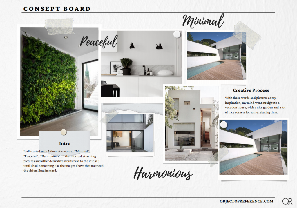
So I started from the very beginning. I sat down with my favorite music and a brand new notebook, writing down some words/themes I would like to see in my new project. “Minimal”… “Peaceful”…” Harmonious” were some of the first words that came to mind. I then started working on some pictures and ideas that we’re matching the energy these words mean to me.
With these pictures as my inspiration, my mind went straight to a vacation house, with a nice garden and a lot of nice corners for some relaxing time.
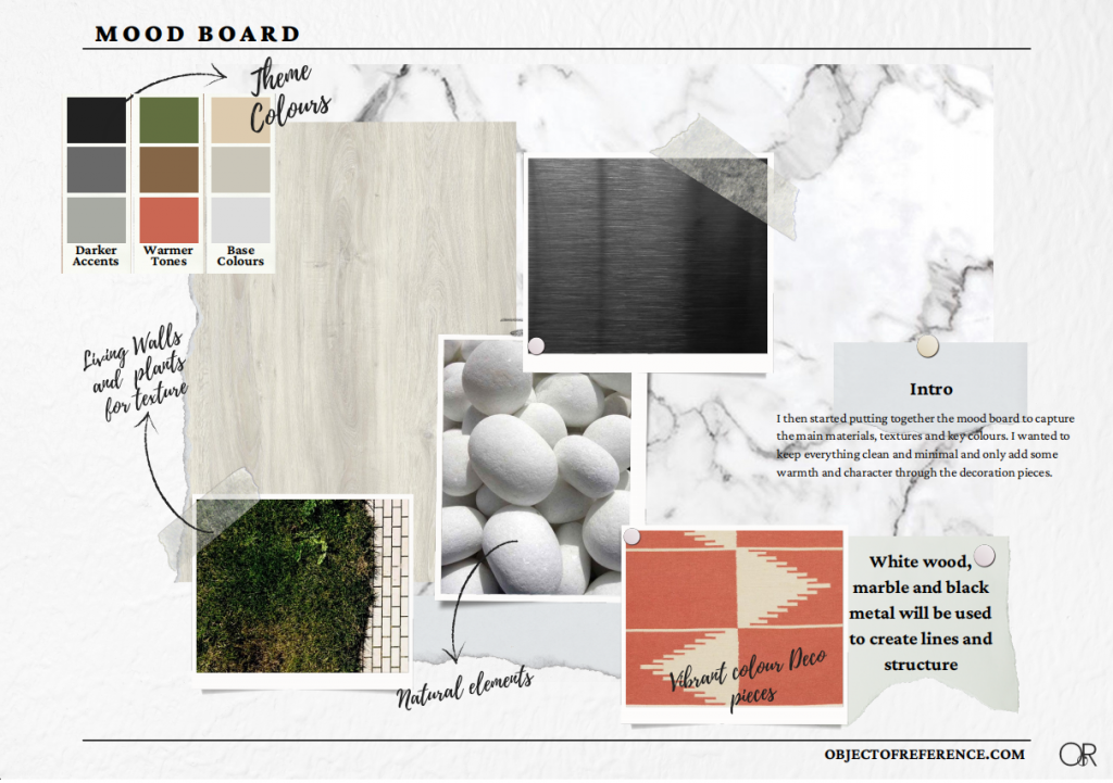
My next task was to put together the mood board as an attempt to gather the materials and color theme. I wanted to keep everything clean and minimal and only add some warmth and character through the decoration pieces.
And then the harder par started. I have been looking for a good and easy-to-use 2D and 3D platform/tool that would allow me to not only design the basic floorplan of the house but also help me with High-quality pictures for the rendering part. After months of looking online and trying probably most tools out there, I decided to create an account with Coohom.com. And I couldn’t be happier with this choice. Coohom gives you a great intro to all the available tools and is one of the most straightforward tools out there. You literally, add your pieces and details on your project and you then have the option to amend the materials, and the size of the pieces, and then review them through the preview 3D rendering functionality. But I am getting ahead of myself. Let’s start from the beginning…
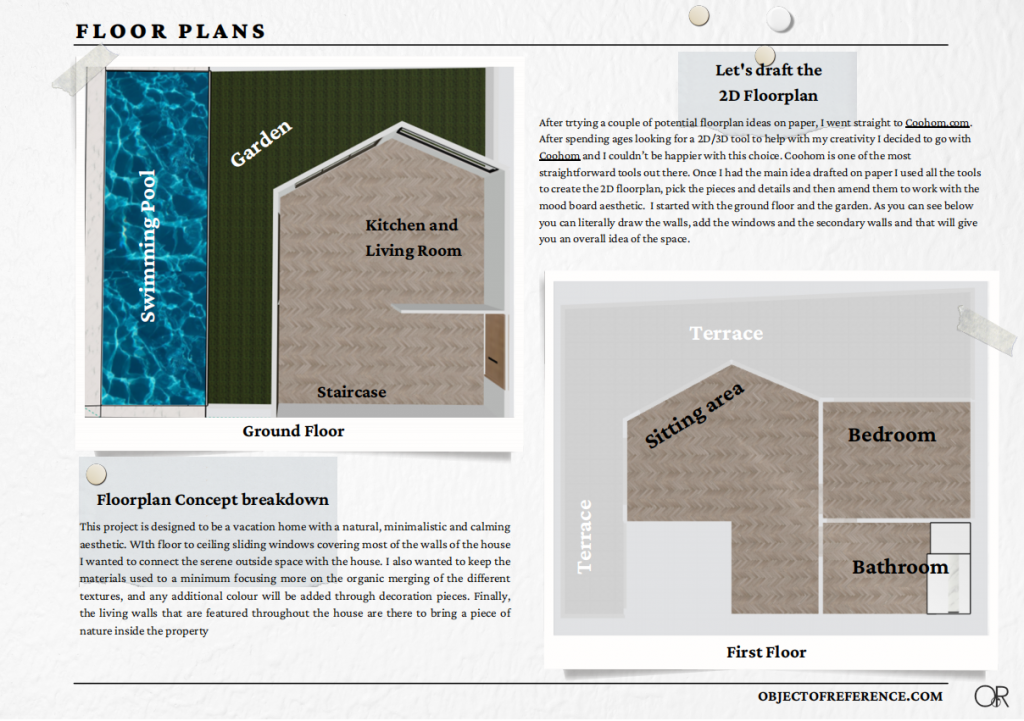
I started with the ground floor and the garden. As you can see below, you can literally draw the walls, add the windows and the secondary walls, and give you an overall idea of the space.
Since this is a vacation home, I imagined the house and the outside space constantly interacting. On a hot summer day, I can see all the floor-to-ceiling windows open so that the summer breeze can organically travel through the space. Also, the convenience of cooking something, and then just stepping outside with minimum effort made me think that everything should be spacious and open-plan. I then thought about the 2nd floor and the bedroom and bathroom arrangement.
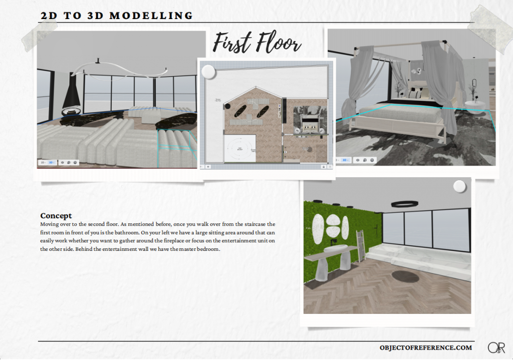
Following a similar approach to the ground floor, the landing of the staircase brings you to a spacious sitting area. The balcony is going all the way around the first floor allowing the occupants to enjoy the view wherever they are. The first room is the bathroom that will have 2 doors, one of them is the main door for your guests, and then the other door will link the bedroom to the bathroom. The sitting area will feature an entertainment space but also a fireplace.
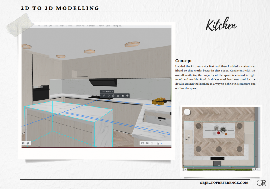
And now…I am ready for the fun part…Adding some life and character to the space…The first step is the kitchen…
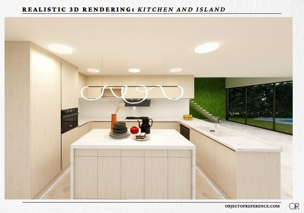
I added the kitchen units first and then I had to customize the island so that it works for the space the way I wanted it to. Following the mood board, I put it together. I am playing with light wood for the main units, with an understated marble for the island and the countertop. Then I added some definition with the darker metal details. And this is I realized the benefits of Coohom. Before you go any further, you get to see a 3D mock-up of what the final product could look like.
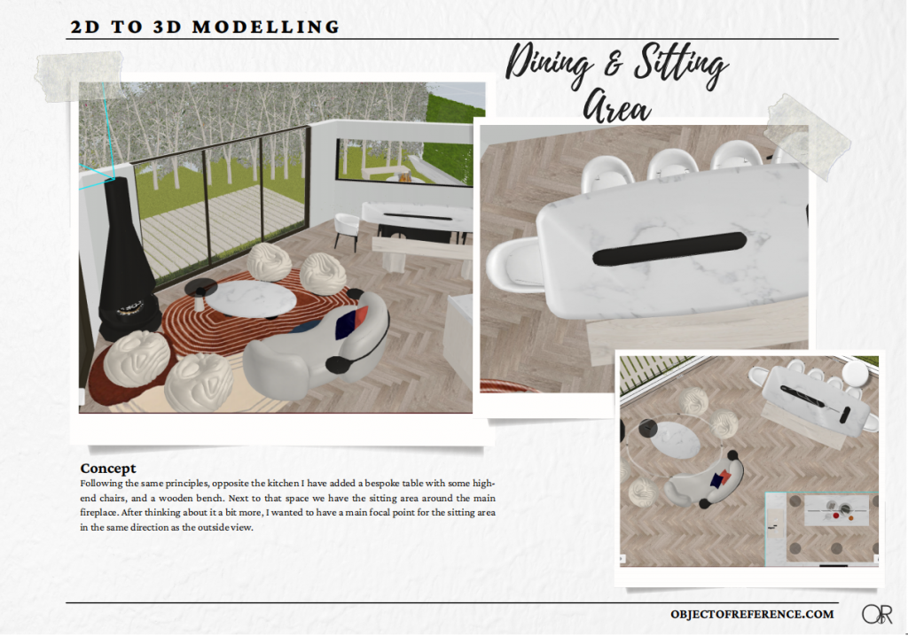
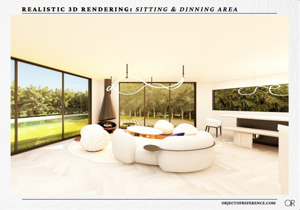
Following the same principles, opposite the kitchen, I have added a bespoke table with some high-end chairs, and a wooden bench. Next to that space, I have added a sitting area around the main fireplace. After thinking about it a bit more, I wanted to have a main focal point for the sitting area in the same direction as the outside view.
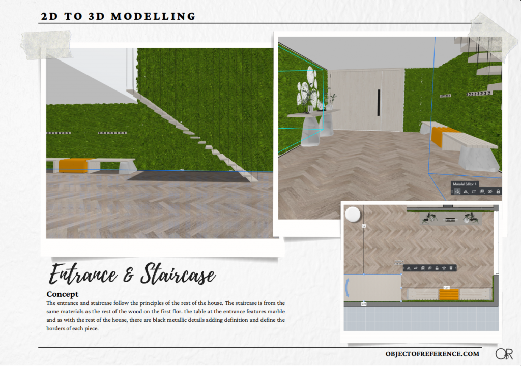
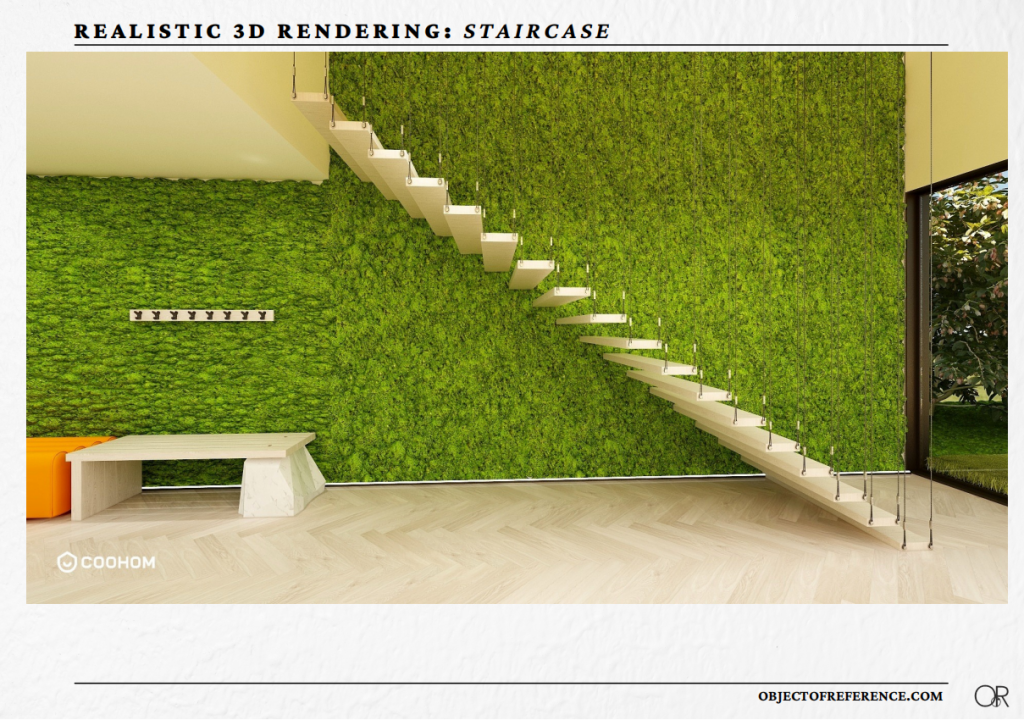
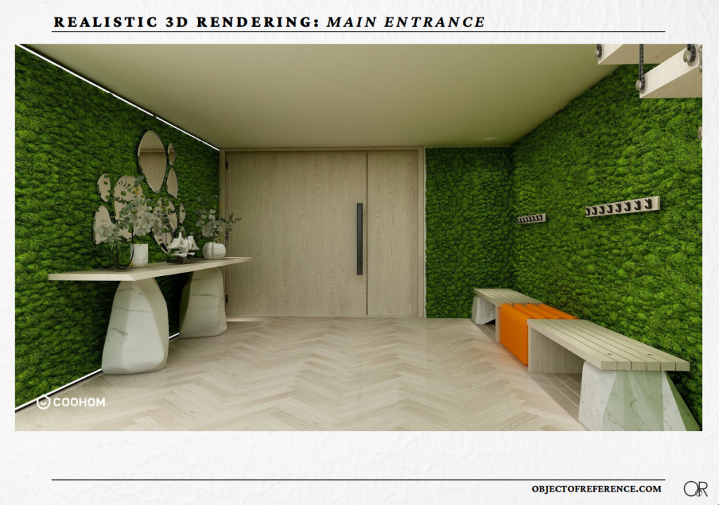
Finally, the last part of the ground floor is a statement plant wall and the staircase leading to the first floor.
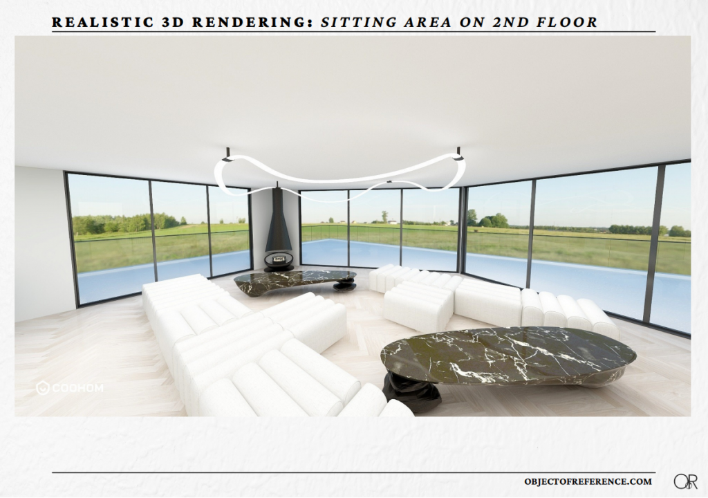
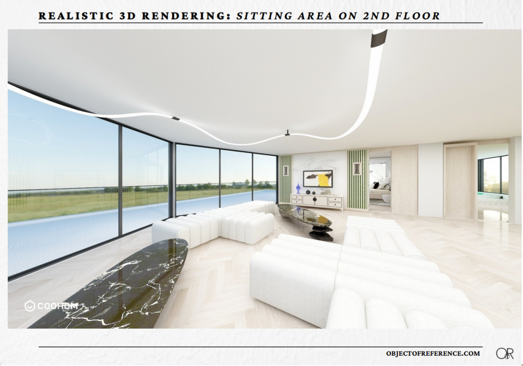
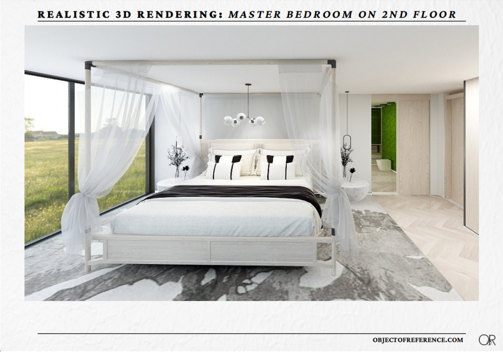
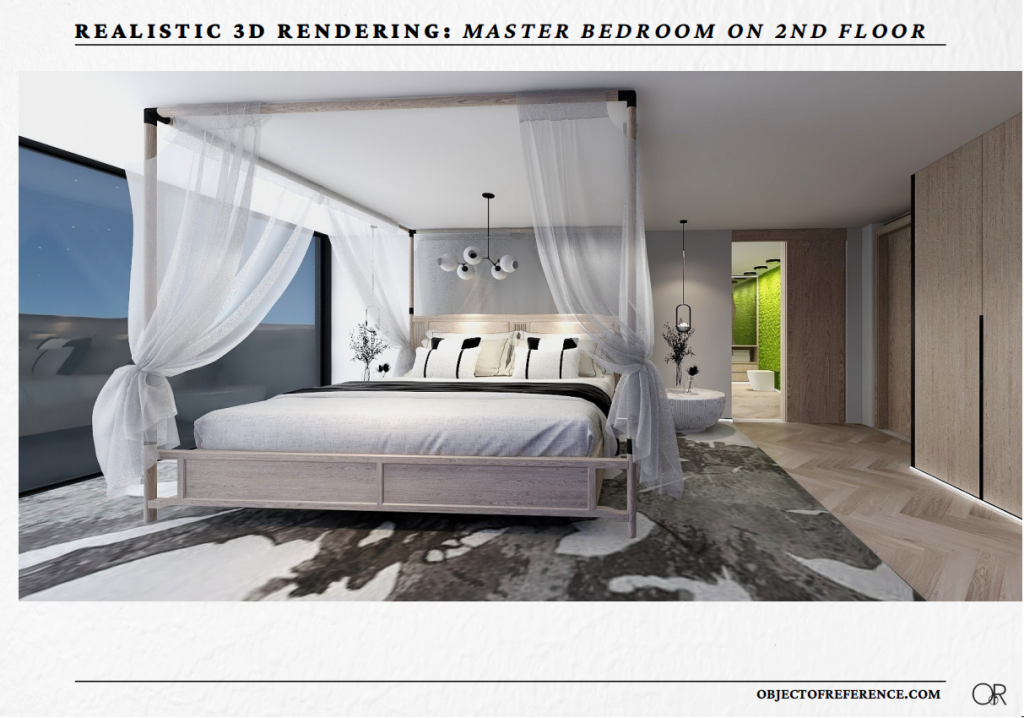
Moving over to the second floor. As mentioned before, once you walk over from the staircase the first room in front of you is the bathroom. On your left we have a large sitting area that can easily work whether you want to gather around the fireplace or focus on the entertainment unit on the other side. Behind the entertainment wall, we have the master bedroom.
And just a preview for each room:
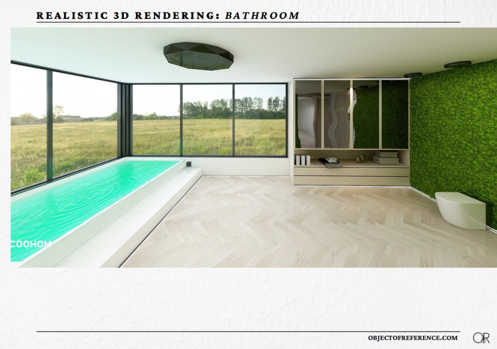
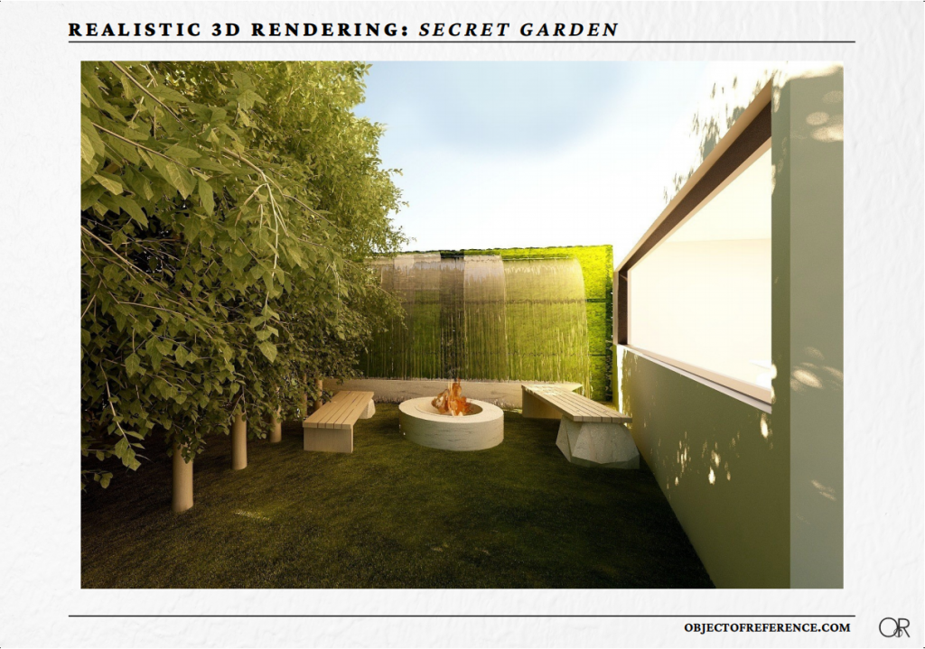
After a couple of days of working on all the final details for every room, I was ready to hit the Render button. And this is where the true magic of Coohom becomes apparent. After choosing the time of day, light levels, and background of the rendering you just click Render. And within seconds you get probably the most realistic images, at least I’ve ever seen on the platform I’ve ever used. Here are some examples.
HIGH-QUALITY IMAGES
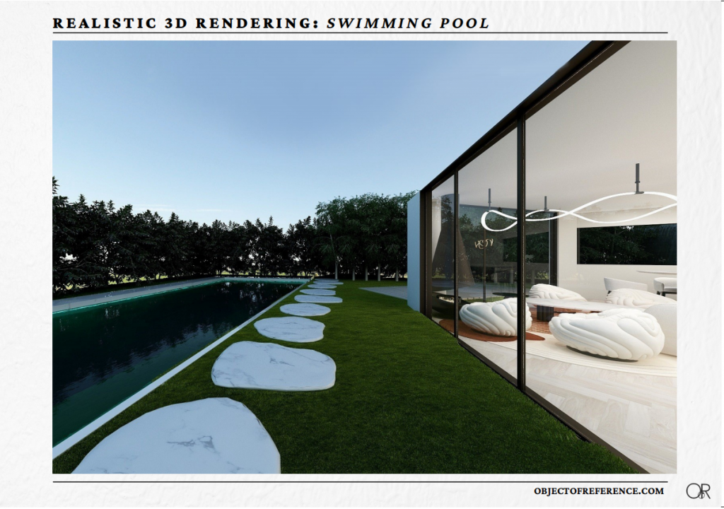
I will continue working on this and I will keep adding some more details and decoration pieces to make things complete. But in the meantime don’t forget to click here and create your free Coohom account. Whether you just want to see how a new sofa is going to look in your sofa, or you want to build and decorate your house from scratch Coohom is the tool for you.
Social Contact:
LinkedIn | Facebook | Instagram | Twitter | YouTube
Media Contact:
>>> Schedule a DEMO!




Kyri
Massive thank you for featuring my Blogpost here…I couldn’t have done this without Coohom…honestly the best platform I’ve ever used…